From the Bookshelf
L is for Look — Children's Photobooks
The Brutalist has been sitting in my Apple TV library for over a year. I finally got around to watching it this week, maybe prompted by return visits to the Barbican and Erno Goldfinger’s house.
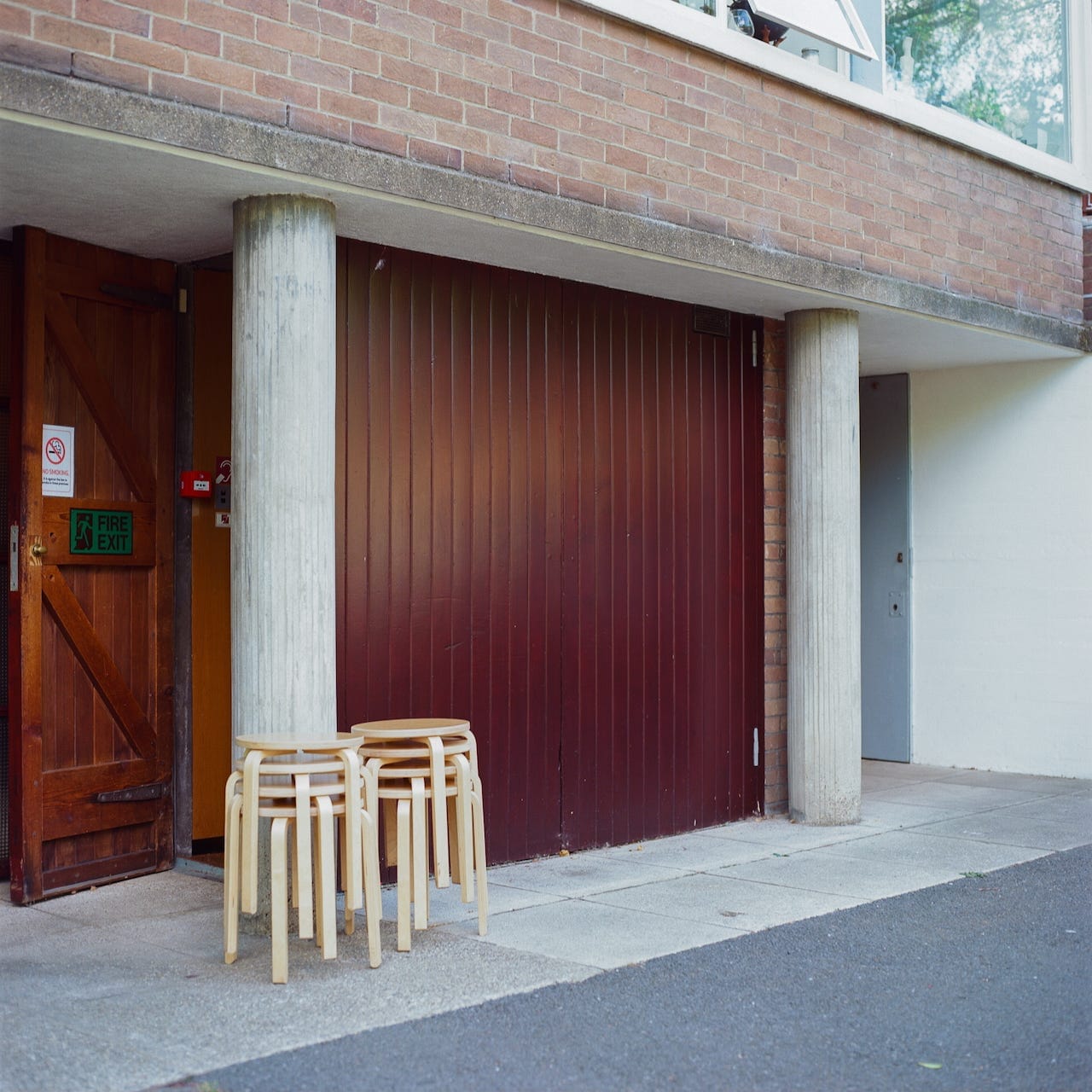
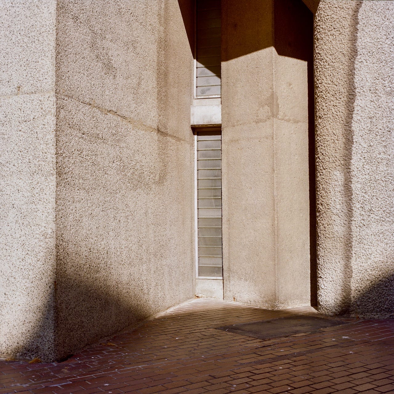
Jon Nicholls - Goldfinger House and Barbican, London, 2026
It’s hard to make interesting images of such iconic buildings. How do you avoid convention and cliché? The Brutalist opens inside a ship’s dark hold and climbs up through it to the deck where the light breaks in and the Statue of Liberty rotates into frame completely upside down. The titles then scroll in a modernist type with the spacing pulled about, letters set at unusual intervals and accompanied by graphic elements. Sebastian Pardo, the designer, researched Bauhaus books and Moholy-Nagy’s typophoto, the welding of photograph and type into a unified graphic statement. I recognised the visual grammar, more than a hundred years old, and found it both thrilling and disorientating. A language that seems settled and historical, safely shelved in the museum, can still turn the familiar upside down and make you look again.
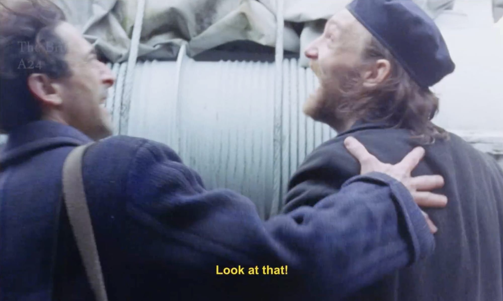
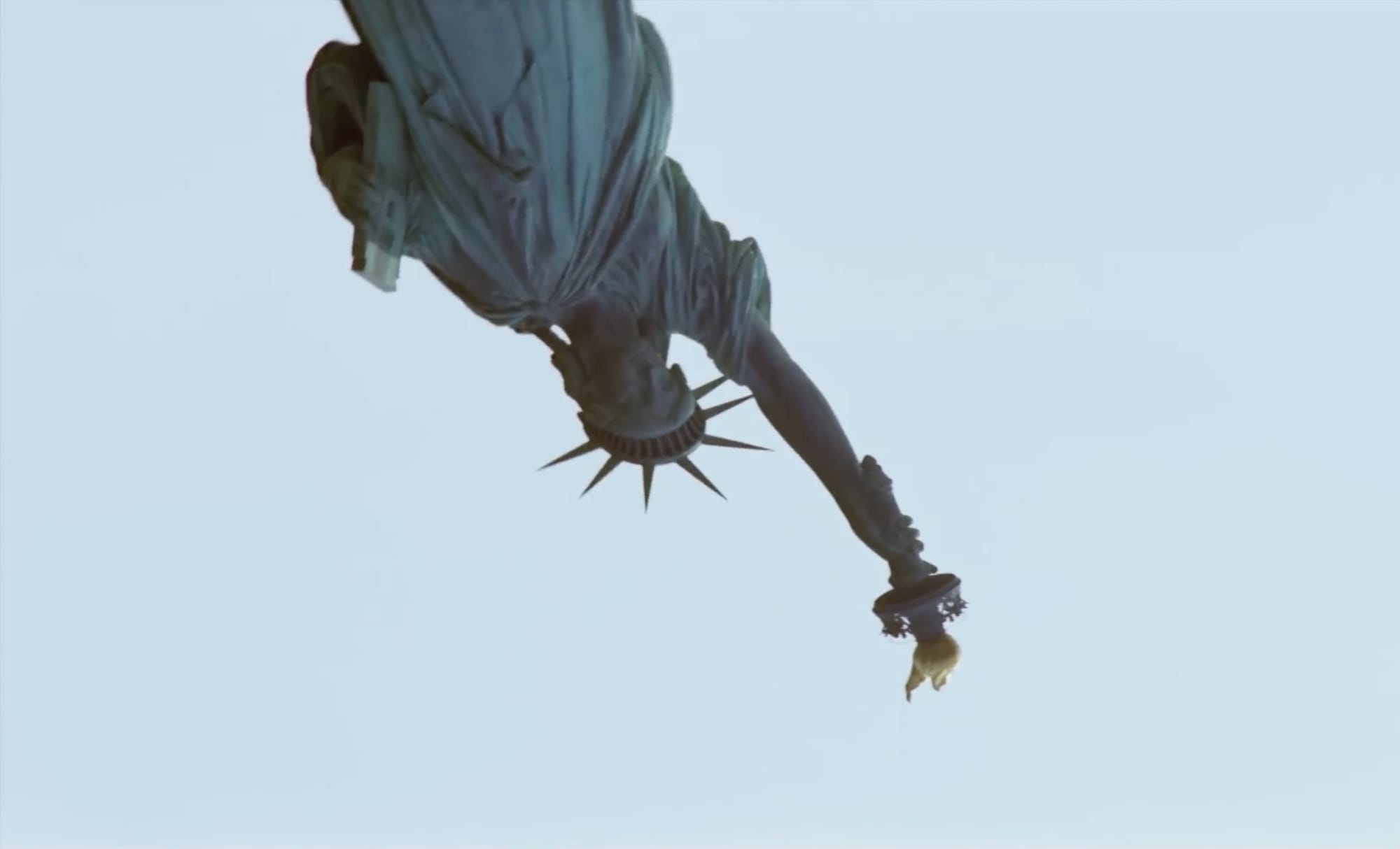
The Brutalist opening sequence
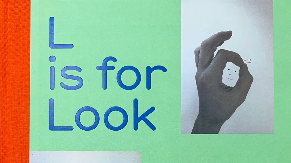
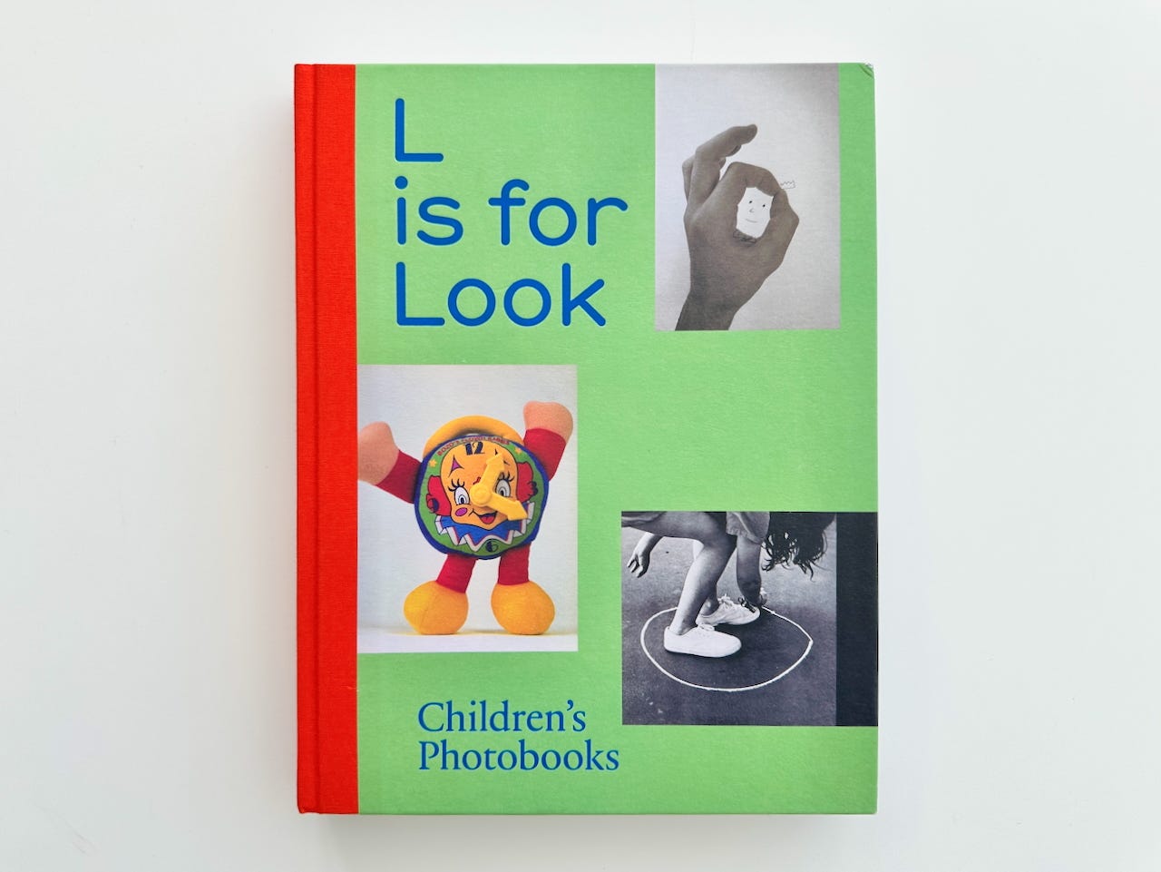
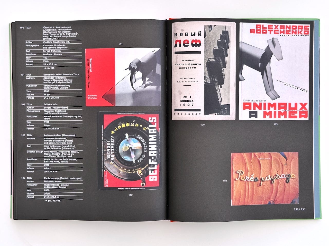
In my post about John Pickering’s War in the Meadow I promised a review of a recent purchase, a book about the marriage of word and photograph, though it comes at it from an unlikely direction. L is for Look, edited by Anne Lacoste and Rose Durr and published by Spector, is the catalogue to a travelling exhibition and a study of the children’s photobook, that odd, half-forgotten genre in which photographs were set to work teaching the very young. I have a weakness for these books and for their close cousin the prison photobook. They sit nearer to one another than they sound. One is an habilitation, the education of a looker who has not yet learned to read the world. The other is a rehabilitation, the education of someone the world has locked away. Both put photographs in front of people held under some constraint and ask what an image can teach and what it can be made to testify. The War in the Meadow post explored the gap between the story a child tells and the thing the darkroom makes of it, full of pedagogic opportunity. I opened L is for Look looking for that gap and found it on nearly every page.
The genre begins in a faith that the book itself slowly takes apart. When Edward Steichen photographed everyday objects for his daughter’s The First Picture Book in 1930, the case for it was that a photograph gives the child raw, unbiased reality, this is a fork, this is a plate, with none of the viewpoint a drawing smuggles in. The photograph was trusted because it looked like fact. A good part of the pleasure of L is for Look is watching a hundred years of the people who made these books discover that photographic facts won’t sit still, that a photograph of a fork also carries with it a whole cluttered afternoon and that the surplus, the part no caption ever quite settles, might be where the teaching quietly happens.
That L is for Look exists at all is the first thing to notice. There’s been almost nothing in English on the children’s photobook, which until now has been studied seriously only in French, by Laurence Le Guen and the scholars gathered around the PHLIT database. What Lacoste and Durr have done is claim the genre for the history of photography and lift it out of children’s-literature studies, where it always ranked below drawing as the poorer and more literal cousin. For anyone who thinks with photobooks, that redraws the map and adds a shadow century to it. The exhibition it accompanies is touring, and hopefully lands at The Photographers’ Gallery some time in 2027-28.
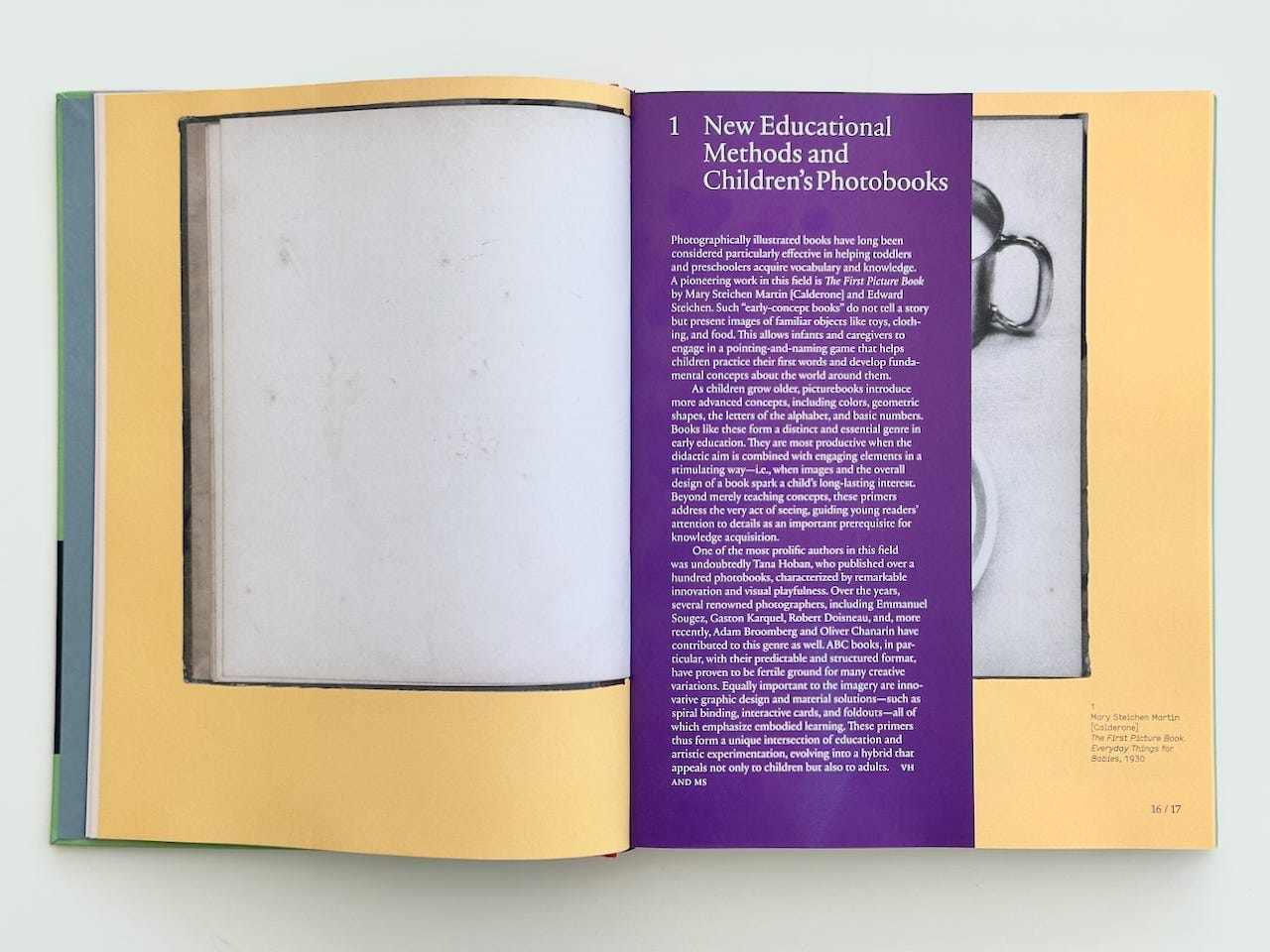
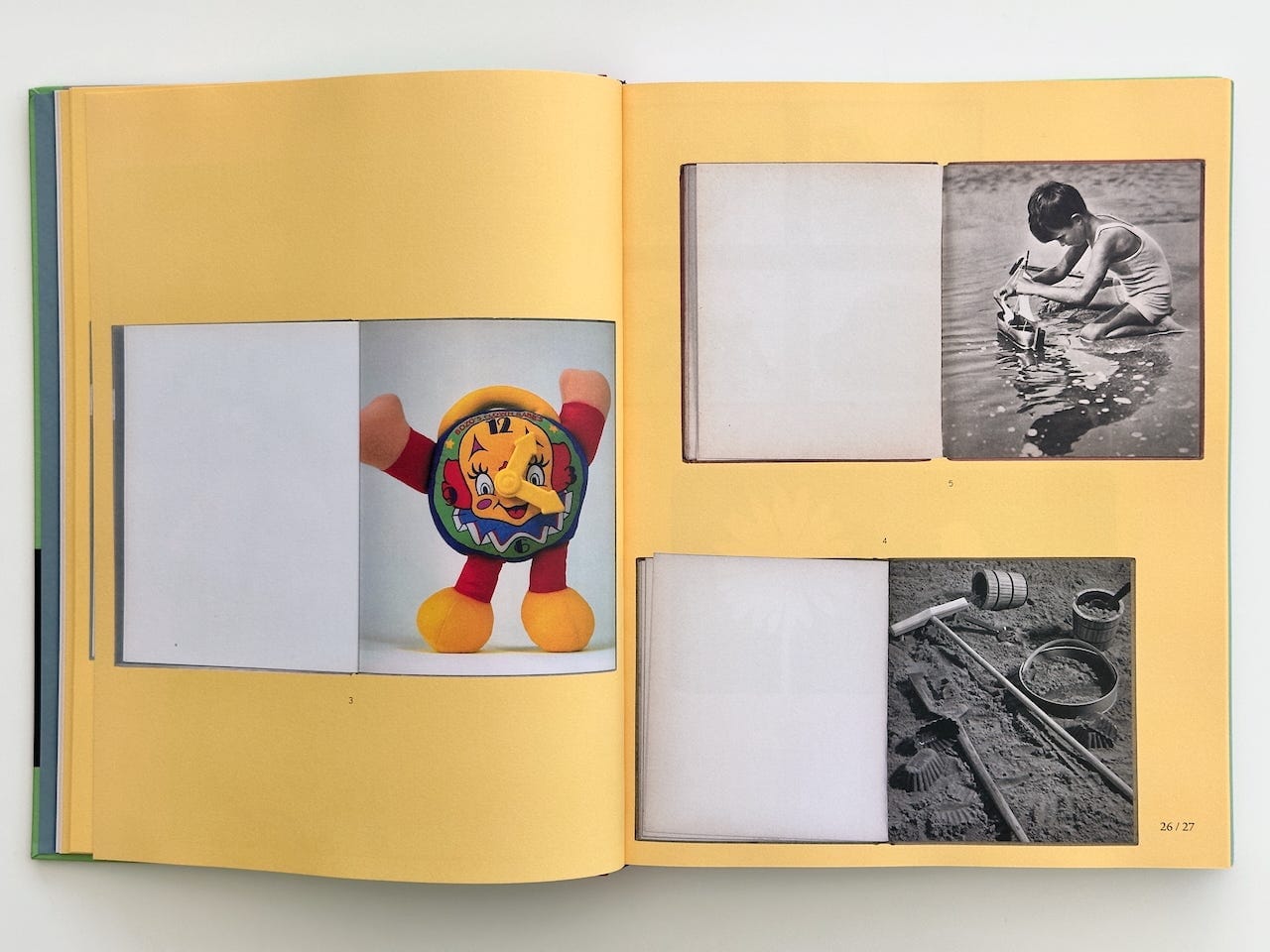
The book is also, in its making, an argument. Helmut Völter and Ina Kwon have designed it so that each children’s photobook is photographed as an object, caught mid-turn, floating on coloured grounds keyed to the sections, its captions and texts set on thin inserts that interrupt your view of the book spreads. I found that it took me a while to work out which book was which. The effect is a mild disorientation and I’m fairly sure it’s deliberate. I’ve been mostly trained on the adult art photobook, expecting a clean sequence and the captions filed at the back. This design encourages you to encounter pictures that haven’t yet been pinned to their words. You do the matching that a child does.
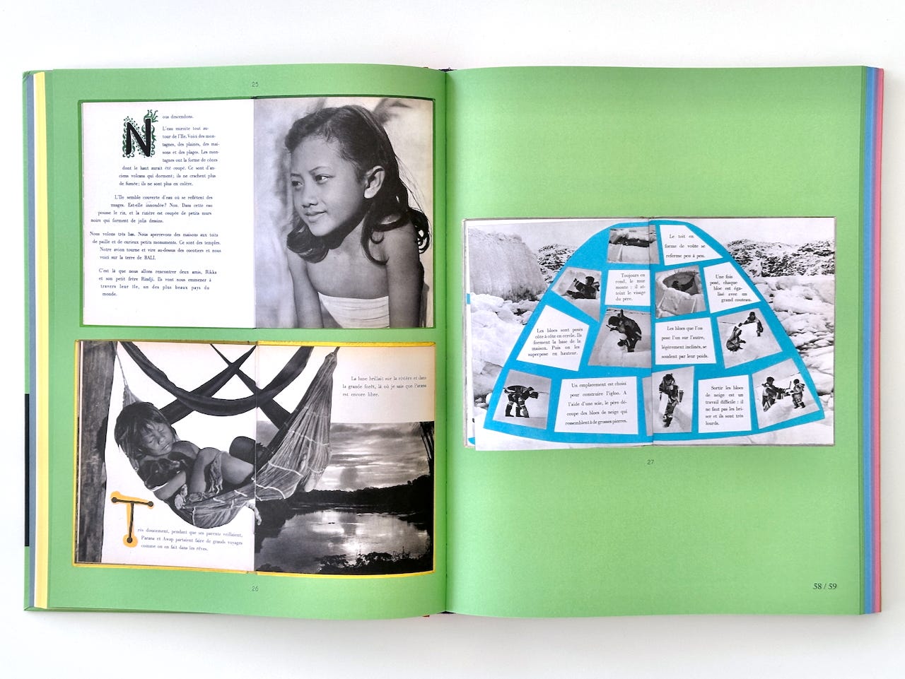
The spread above lines up three of Dominique Darbois's Enfants du monde books from the 1950s, Rikka la petite Balinaise smiling above, Parana le petit Indien asleep in his hammock below, Achouna le petit Esquimau building his igloo opposite, each child named for a people. The Balinese girl is bare-shouldered, her gaze turned away, beautiful in the warm humanist manner of the decade and made available to be looked at. The igloo is built on the page from cut photographs, a way of living turned into a diagram. The text has us descend from a plane onto one of the most beautiful countries in the world, the planet laid out for a Western child to tour. It is the Family of Man remade for the nursery, resting on the faith this book is otherwise dismantling, that the photograph is a transparent window, a universal language carrying the world in all its diversity. It is the fork-is-a-fork faith enlarged to the size of the planet, the neutral surface doing the extracting. The book sees this, to its credit, and its introduction identifies the white-boy default perspective and prefers a more inlcusive selection. But a corrected selection cannot change the shape of the archive it draws from and the beauty of these pages is some of what carries you past the politics in them.
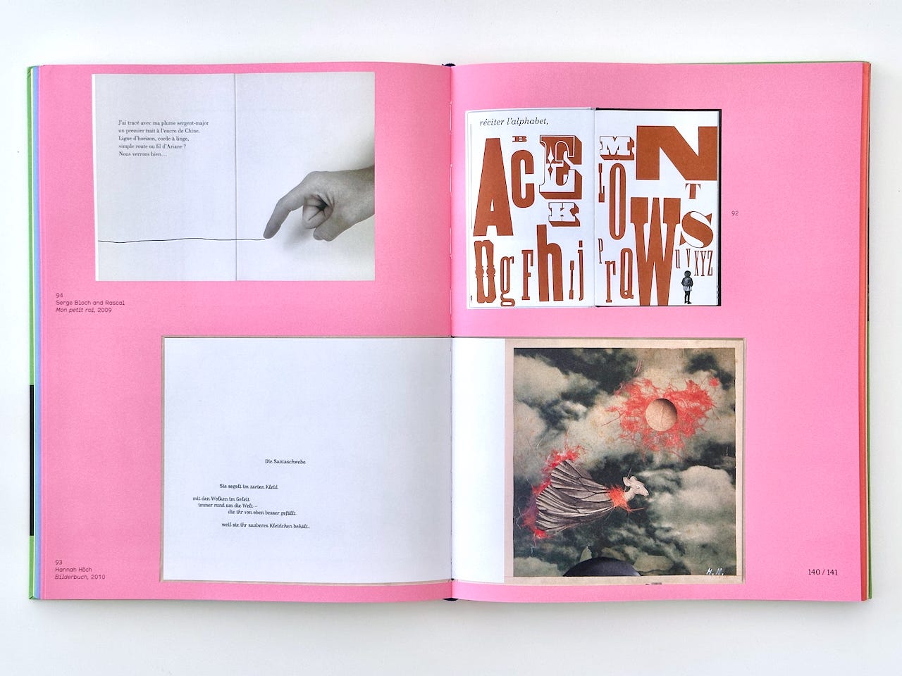
Later on, a page from Serge Bloch and Rascal's Mon petit roi, presents a black-and-white photograph of a hand, a finger appearing to draw a thin line of ink. The verse wonders what the line is — a horizon, a washing line, a road, Ariadne's thread? We'll see. Two kinds of mark share the paper. The hand is photographic, a real hand that was there, lit and particular. The line is a drawing, a pure schema. The photograph is the fact of the hand. The drawing is everything the line might yet become. The child is left in the gap and must do the joining. Below it, Hannah Höch's Bilderbuch presents the wilder version, an imaginary photomontaged creature, sailing above the world in order to keep her little feather dress clean.
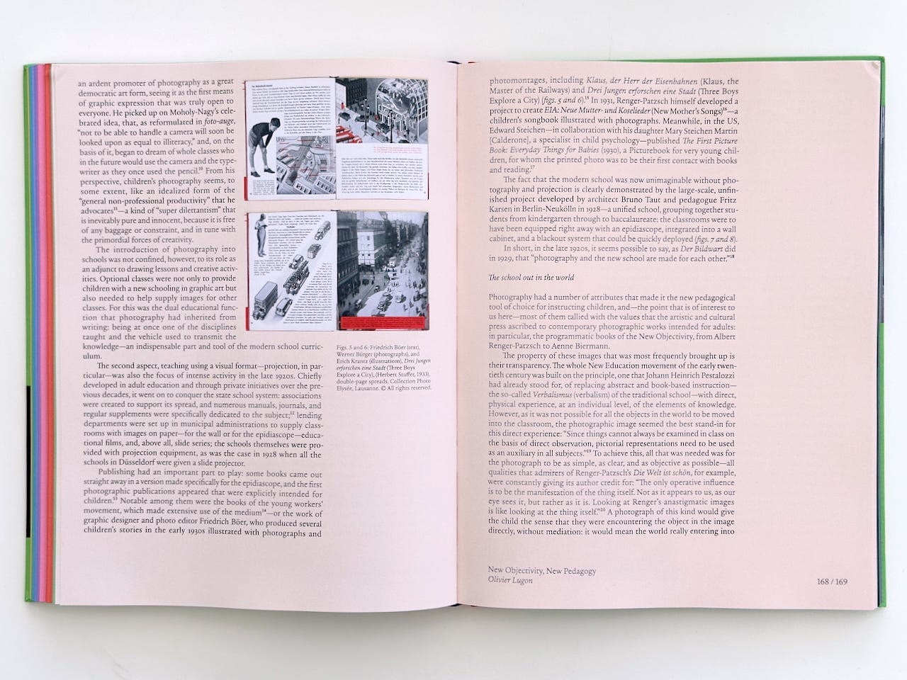
The book is organised into sections, from Education through to what it calls Photographism, each a way that photographs have been put to work for the young. Olivier Lugon’s essay on Aenne Biermann’s 60 Fotos of 1930 traces the children’s photobook back to the New Vision, to Moholy’s claim that the person who can’t handle a camera will be the illiterate of the future and to the avant-garde’s dream of a photographic literacy that would overtake the written word. The Bauhaus grammar I’d met in the cinema, it turns out, went into the nursery. Allegra Baggio Corradi makes the observation that photography stays subordinate to text in the curriculum because it has no formal grammar, nothing to fact-check and nothing to mark, so it sits badly in a system built on measurement.1
In sum, despite photography’s pervasiveness today, the medium is not yet considered a language proper and is still associated with alternative methods for teaching and learning, mostly outside the classroom, often devised by artists.
— Allegra Baggio Corradi
She begins to turn this over, proposing a “shift in the way education is conceptualized” so that it can make more room for what photographs can do. I want to turn it a little more.
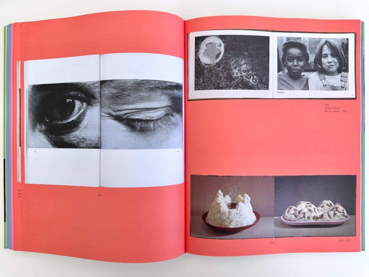
In the education of very young children we give words and pictures more or less parity of attention. The picture book and the primer both grant the image equal standing with the text, set close together, each doing different but complementary work. And then, in secondary school, the settlement changes. The word is handed the authority and the image is demoted to illustration, to the thing a child is shown while the real meaning rides in the sentence. We spend the early years teaching children that images mean and the later years teaching them that images are not to be trusted with meaning of their own. Literacy is language. Numeracy is maths. Pictures are arty farty and, mostly, shoved to the margins.
Why does the switch happen? One possible reason is very old. Reformed Protestantism carried a deep suspicion of the image, the word trusted as the vehicle of truth and the picture suspected of idolatry. A culture shaped by that inheritance may only ever license the image as a ladder to literacy, welcome while the child is climbing towards the word and taken away once the child has arrived. It’s not a tidy story. The founder of teaching-by-pictures, Comenius, who made the Orbis Pictus, was a Protestant bishop, and the fiercest distrust of images belongs to traditions that cut clean across the line between Catholic and Protestant. There’s a duller explanation too. Schools are built to measure and will always prefer what can be easily assessed. The word and the number are more easily marked than the the look. Whichever is the larger cause, the two push the same way, towards a classroom in which the image is welcome as a means and mistrusted when it tries to be an end.
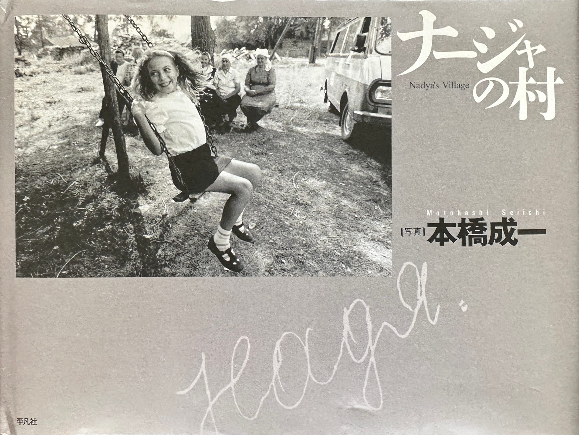
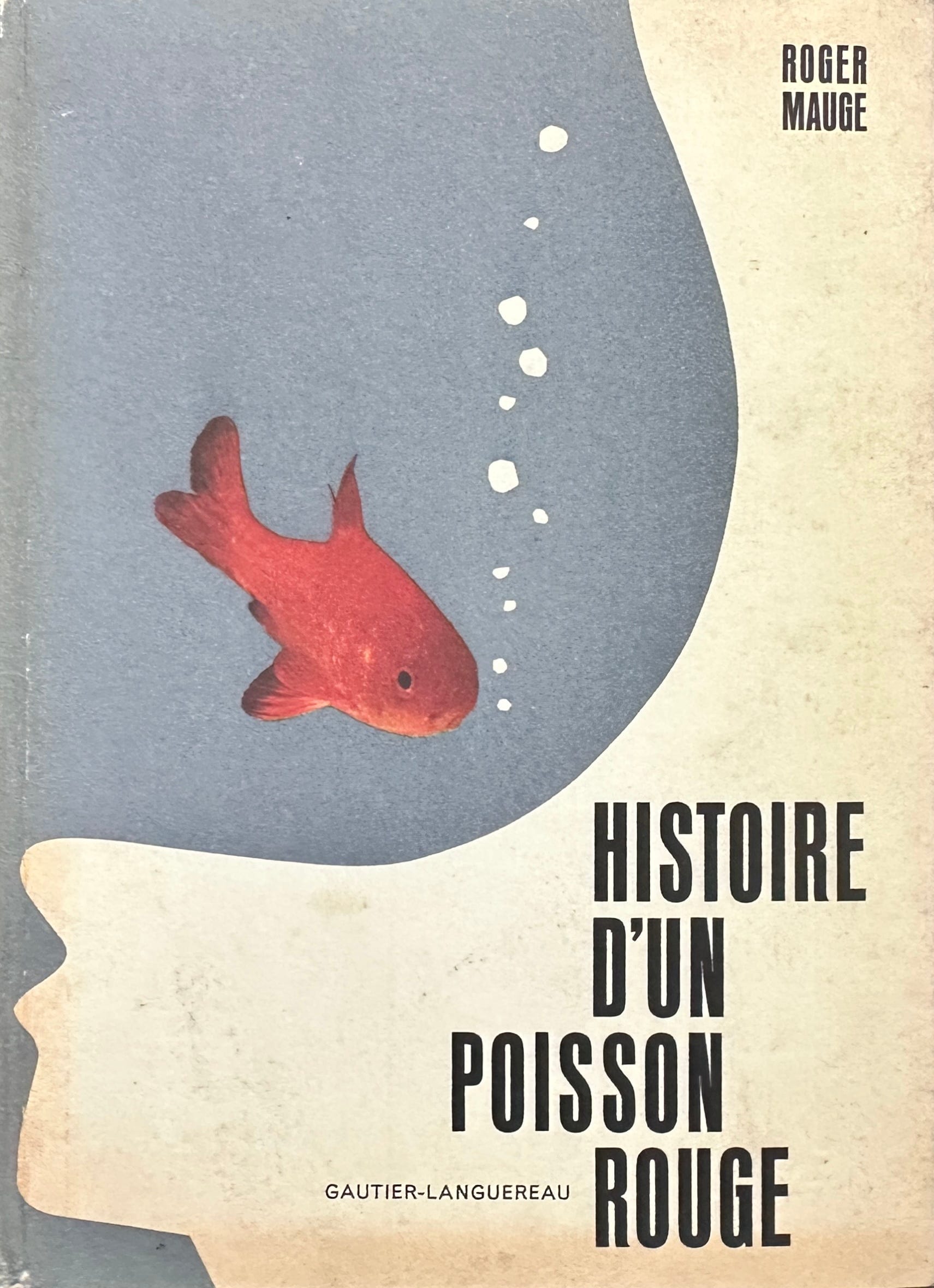
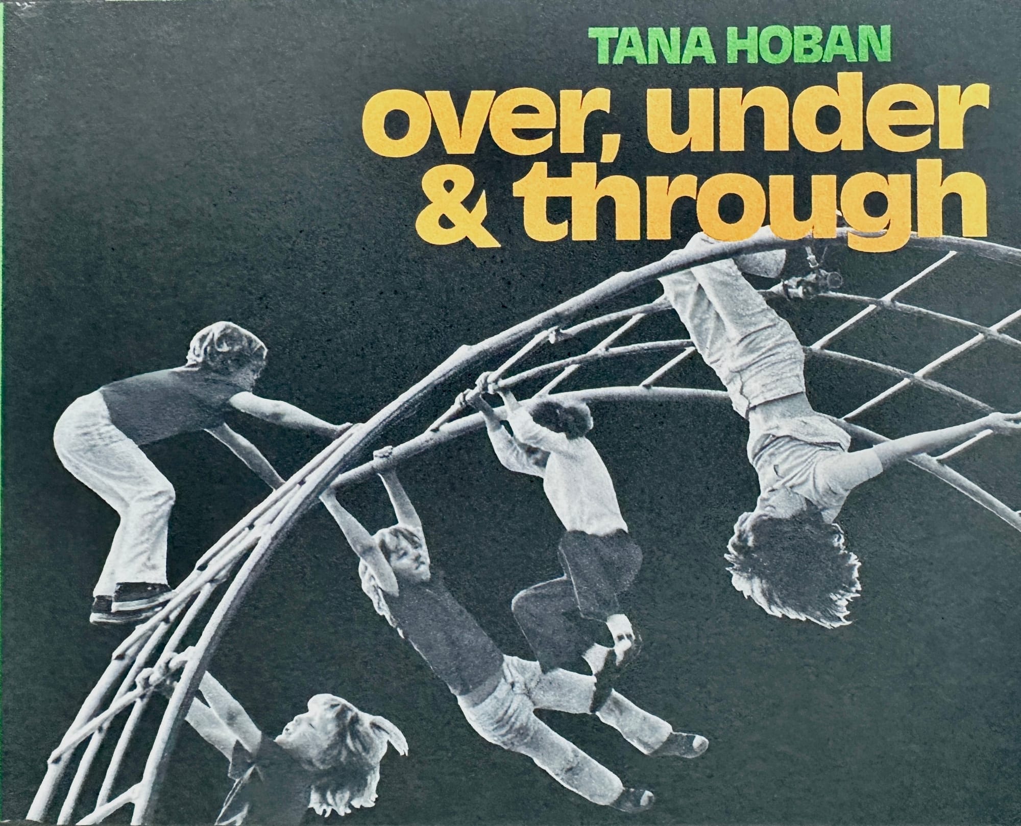
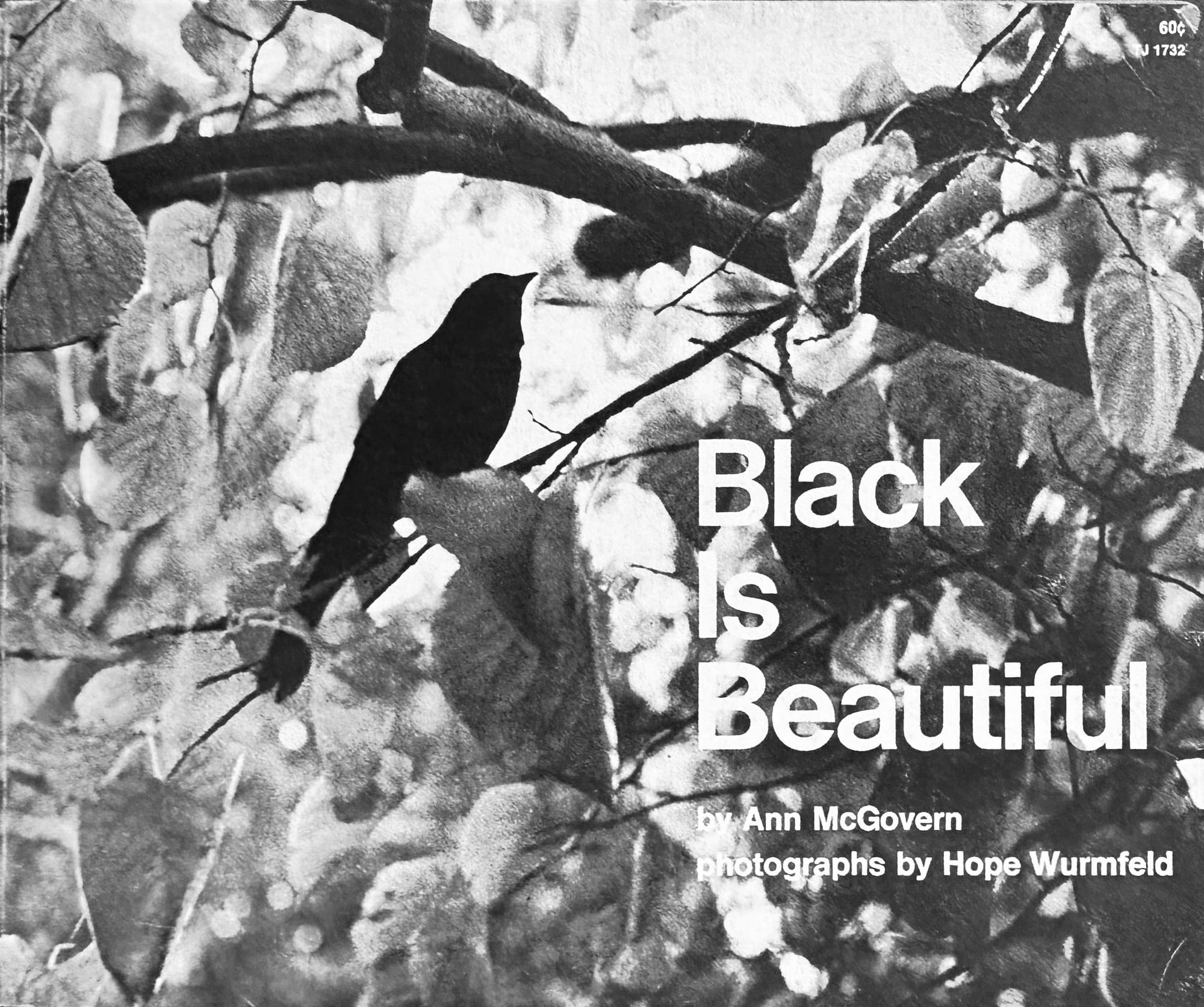
Which leaves the photography classroom as one of the few places in a school where words and images might be given equal billing. The looking it teaches won’t resolve into anything you can easily put a tick against. It belongs to the part of education that opens a complex world rather than delivers a predictable outcome.
Most of what governs us now arrives as an image, below the level of argument, persuading without declaring itself. Someone who’s been taught to look, to hold a picture open against its words and to notice the gap between them, is harder to govern by pictures. The children’s photobook has been doing this work all along, testing the gap between words and images for over a century, on the youngest readers, in a form we have underestimated. L is for Look takes the form seriously, which is reason enough to own it. The statue above the ship is the most familiar thing in the world until it’s turned upside down and you have to look at it again.
L is for Look: Children’s Photobooks, Spector Books, 2025
Thanks for reading PhotoPedagogy! Subscribe for free to receive new posts.
These posts will always be free but, if you enjoy reading them, you can support my analogue photography habit, and that of my students, by contributing to the film fund. Thanks to those of you who have already done so. All donations of whatever size are very gratefully received.