Something to Push Against
An interview with designer Cameron Leadbetter.

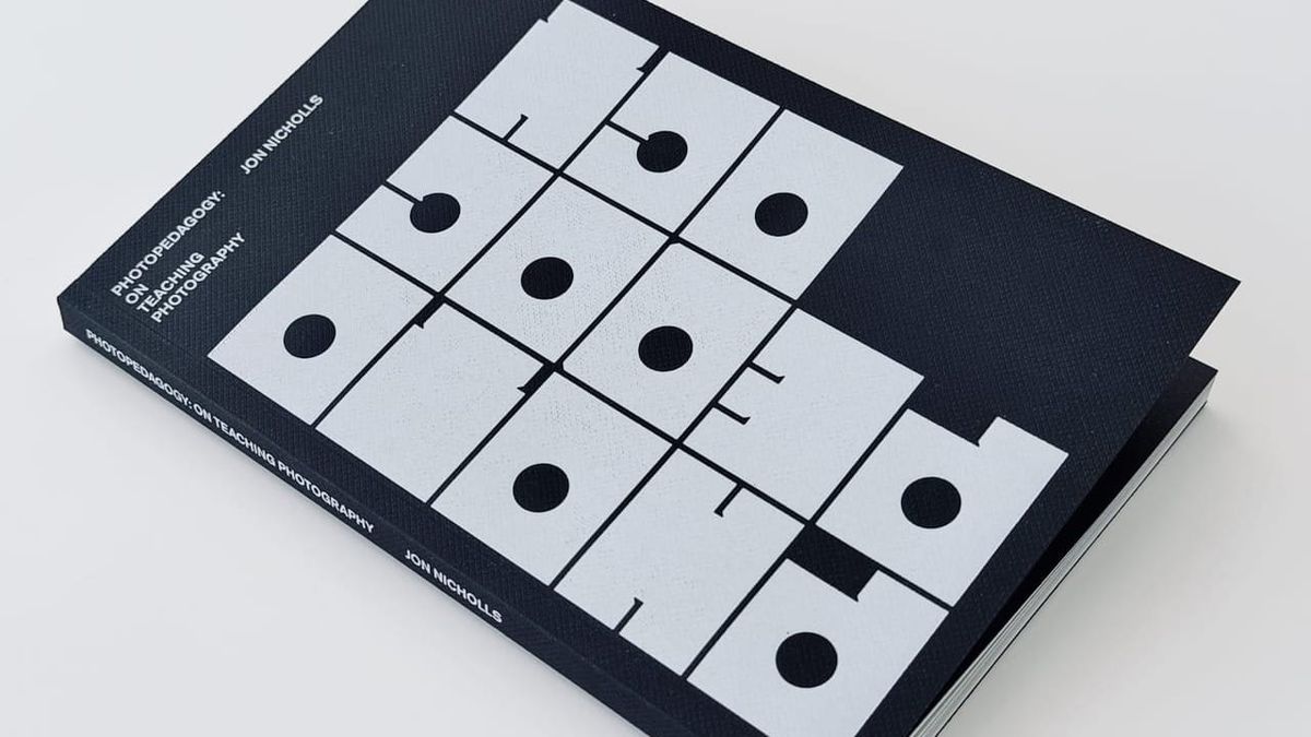
Firstly, thank you to everyone who has subscribed to this version of the PhotoPedagogy newsletter here on Ghost. I've decided to rebuild my subscriber list from scratch so that only those people who have deliberately opted in will receive my ramblings. Do share it with anyone who you think might be interested. This is the first proper post of the new publication. Exciting!
I am delighted to say that my book, PhotoPedagogy: On Teaching Photography has SOLD OUT! Thank you to everyone who has bought a copy. As I got closer to finishing the manuscript, I realised that designing the book myself was not a sensible option. I knew that working with a professional would bump up the cost but I was prepared to take the risk. My first thought was to contact Cameron Leadbetter (aka Shining Studio) whose work for Tate I had long admired. Thankfully, he agreed to take on the job. I thought it might be interesting to hear about the book designing process from his point of view, so I sent him a few questions and here are his responses. There's a breakdown of the finances of my book at the end of the post, for anyone interested. Get in touch if you want any more details.
J: Once you’d agreed to help me, we met at your house for a chat and I brought along some books I liked. Did seeing them help? Did any of what I like turn out to be unhelpful?
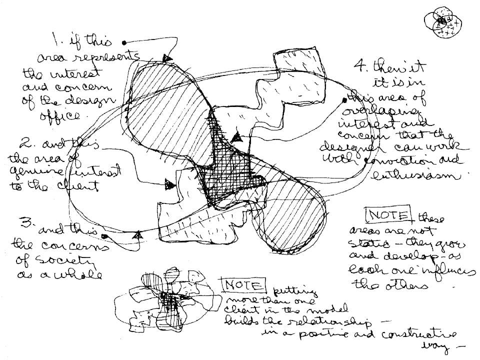
C: Yes, it’s incredibly useful to help me frame, and build an understanding of where your interests lie and where the book sits within a wider culture; how the result might be contextualised or understood; who/where the audience is; what your broader aspirations and reference points are. I was pleased to see the MACK books in your selection, as I’ve always enjoyed their output.Your question makes me think of another ‘reference’ - a venn diagram by Charles and Ray Eames of their model for a successful relationship and the importance of identifying the interests of each party. For me this sharing of references is a key first step, not just in surfacing interests and options, but in establishing a reciprocal relationship! Mutual trust is important in this client/designer exchange. I didn’t find any of it unhelpful even if some was, maybe, discarded along the way.
The book argues for slowness, close looking and the need for teachers and classrooms. Do you think any of that is reflected in the physical object, the pace of the thing and how it asks to be handled?
I hope that the careful choice of materials and processes lend a seriousness to the physical object, maybe give it a weight or physicality that demands attention somehow! Equally, I tried to achieve an enjoyable tactile experience so that the viewer can take pleasure in the process of handling the object to encourage something of that slowness. That the typographic choices and pacing between the parallel texts allow for an unhurried and close reading was also an attempt at reflecting the slowness that you talk about.
I like projects to have boundaries [...] They are something to push against, tease open, use as part of the process of making/imagining/thinking.
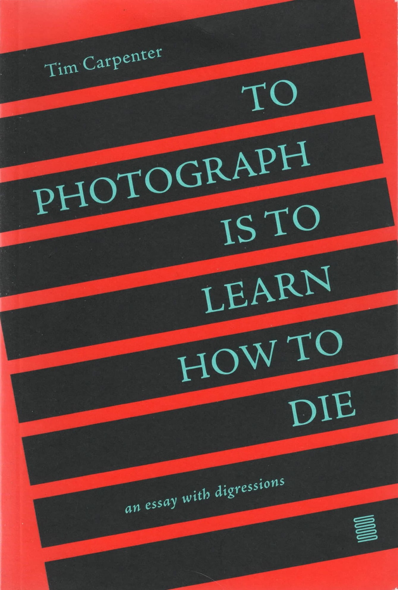
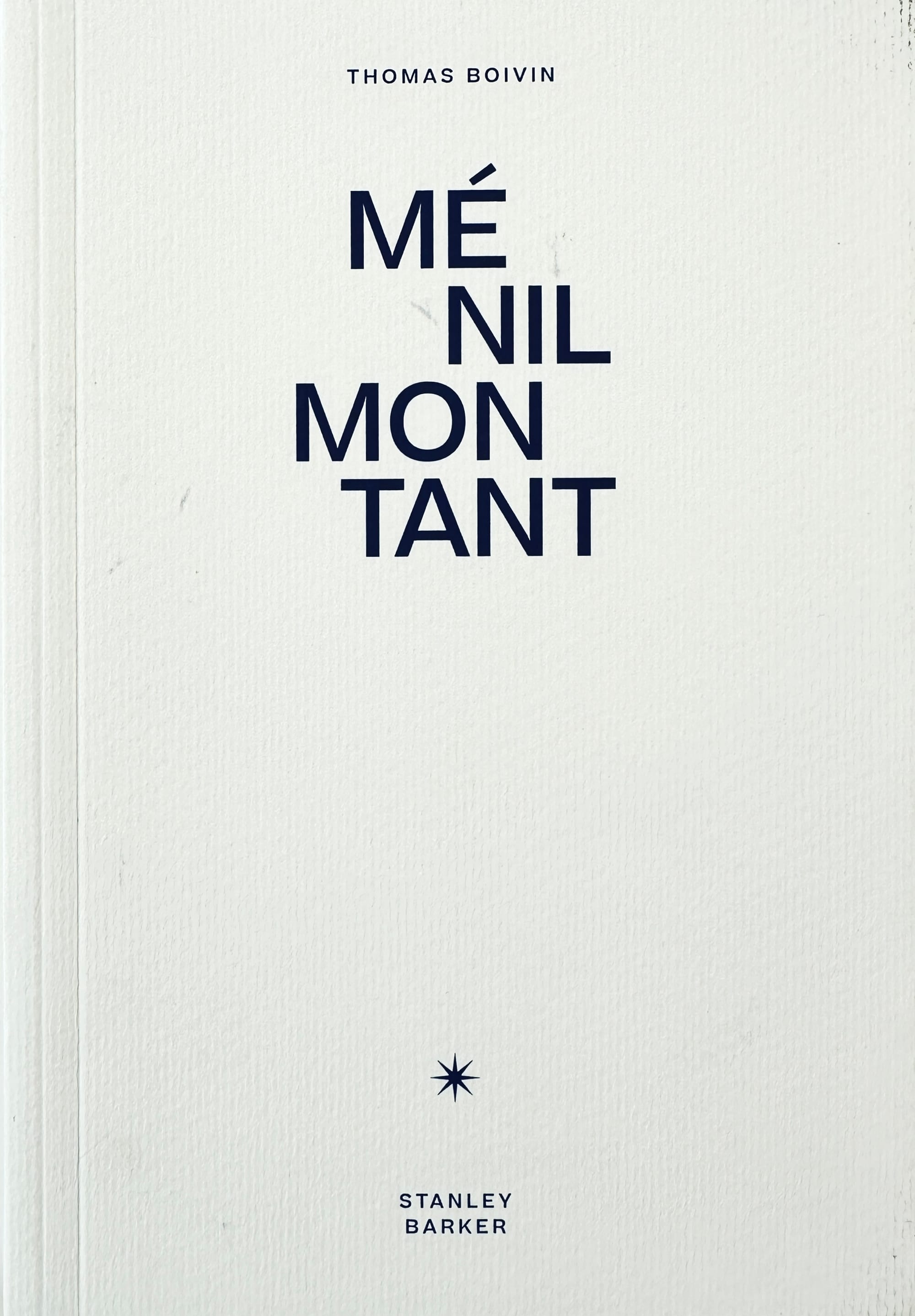
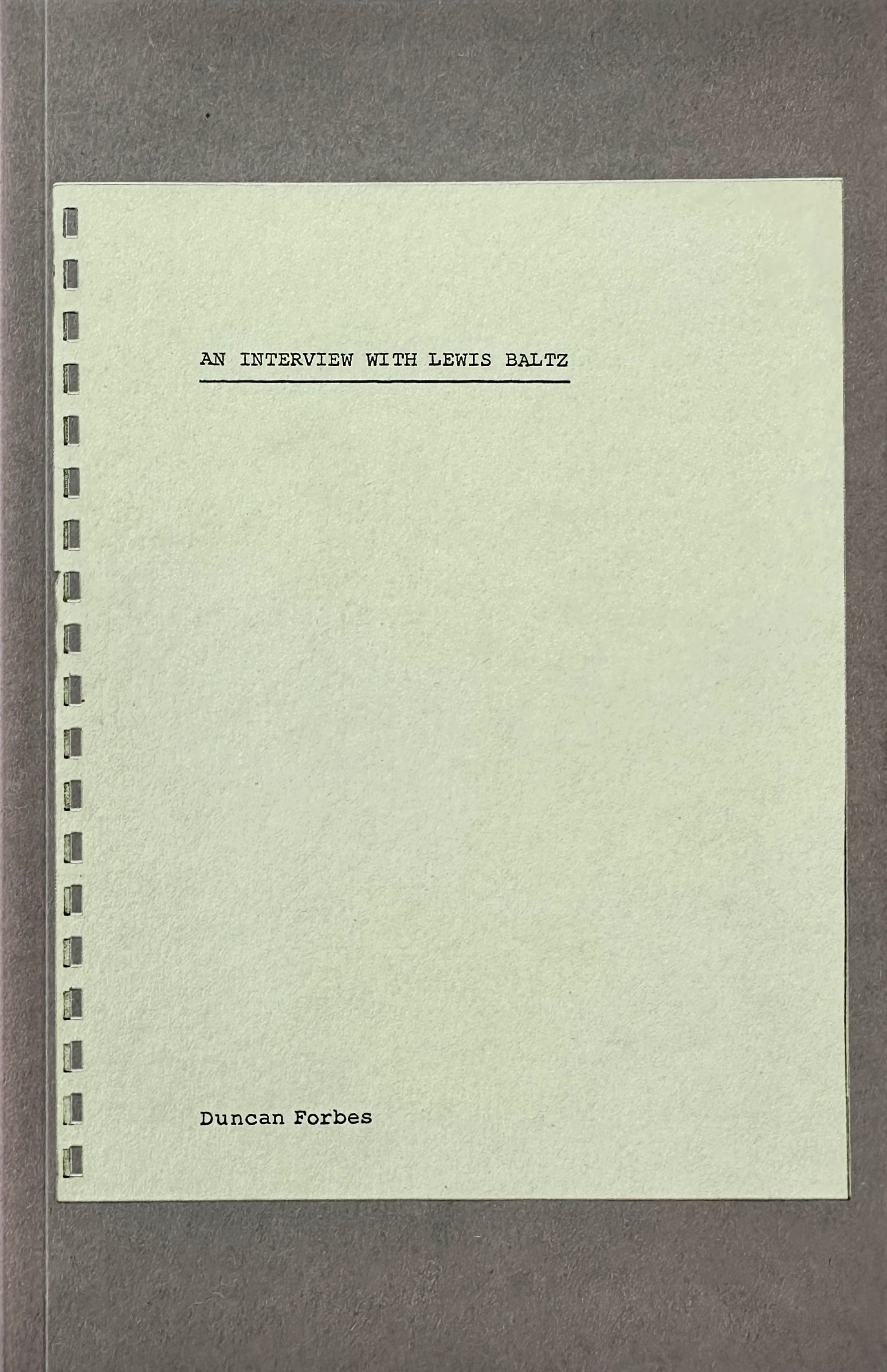
Some of my favourite small format book designs that I shared with Cameron
B-format, 128pp is relatively compact. There are no images. Was the compactness a benefit or a constraint you made a virtue of?
It was a beneficial constraint. I like projects to have boundaries – they provide a foundation from which to build but still allow an incredible amount of freedom – probably allowing more options than might be understood from the perspective of the client! They are something to push against, tease open, use as part of the process of making/imagining/thinking. At some point within any given project a frame needs to be determined – to move towards agreement/completion - so starting with something already in place is helpful. I don’t find it constraining in fact, it’s almost the opposite: liberating!
The parallel texts sit against the main content about ideas and practice in the photography classroom. How did you handle that structurally on the page, so a reader feels the two registers without being told which is which?
After trying out a few options for these – the main text is in a single column, set in a fairly classic, familiar, softcover book of this size, and this established itself first. With the parallel texts I wanted the type to feel second in the type hierarchy, it’s the same size as the references but to give it more weight I reversed the copy out of black. In this way a rhythm was introduced – a break, interlude or small detour – before returning to the primary text. I liked the way this slowed the pace of the chapters.
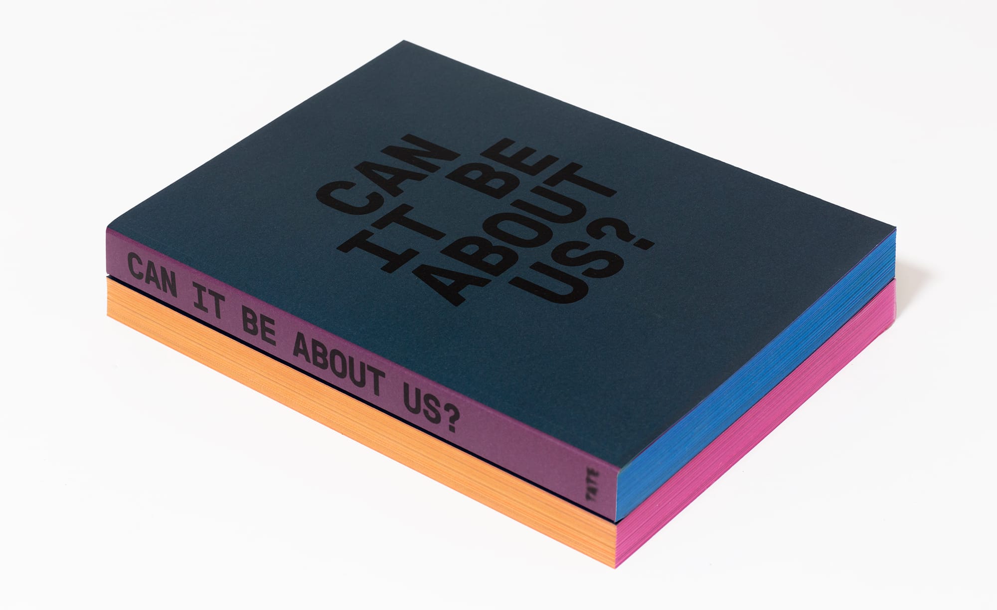
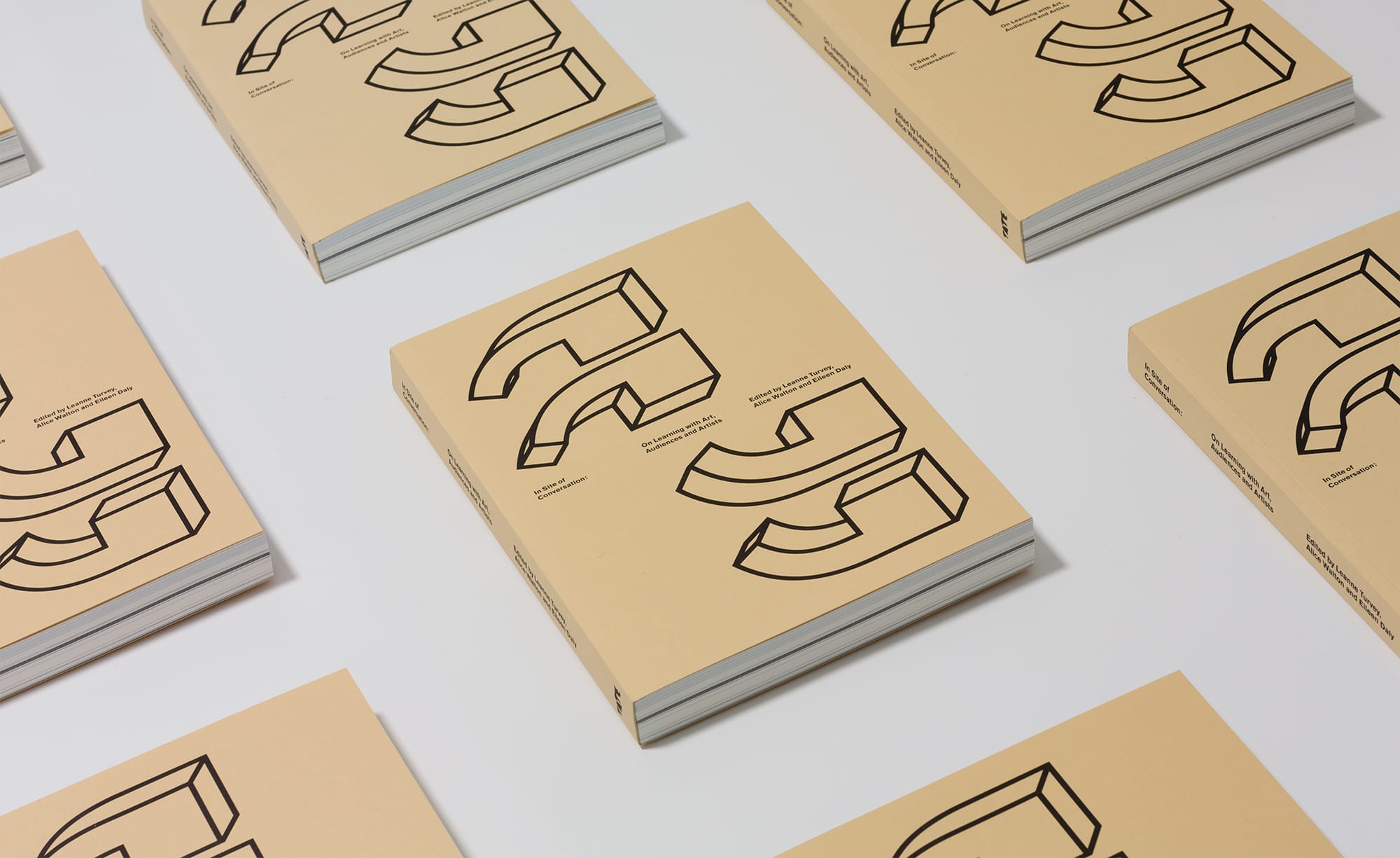
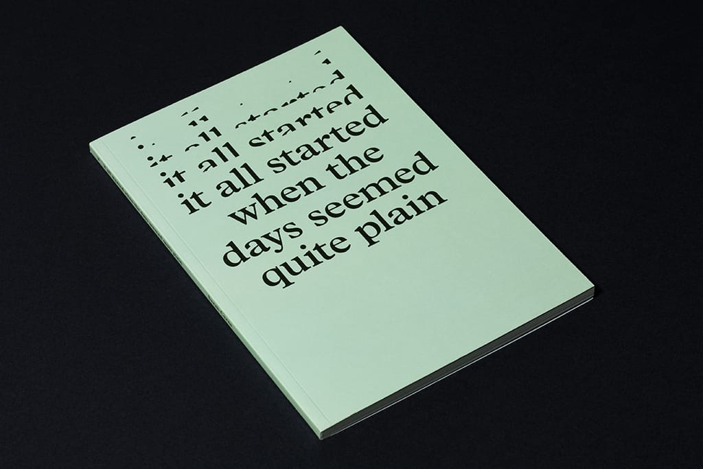
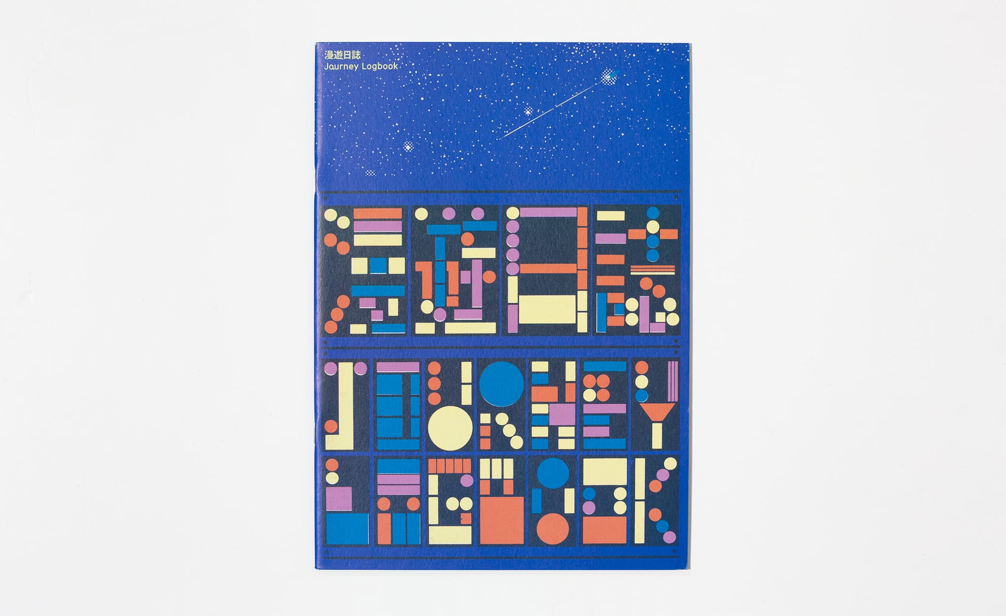
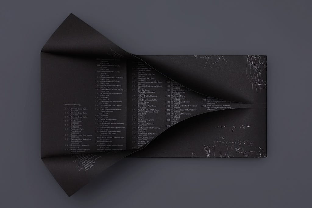
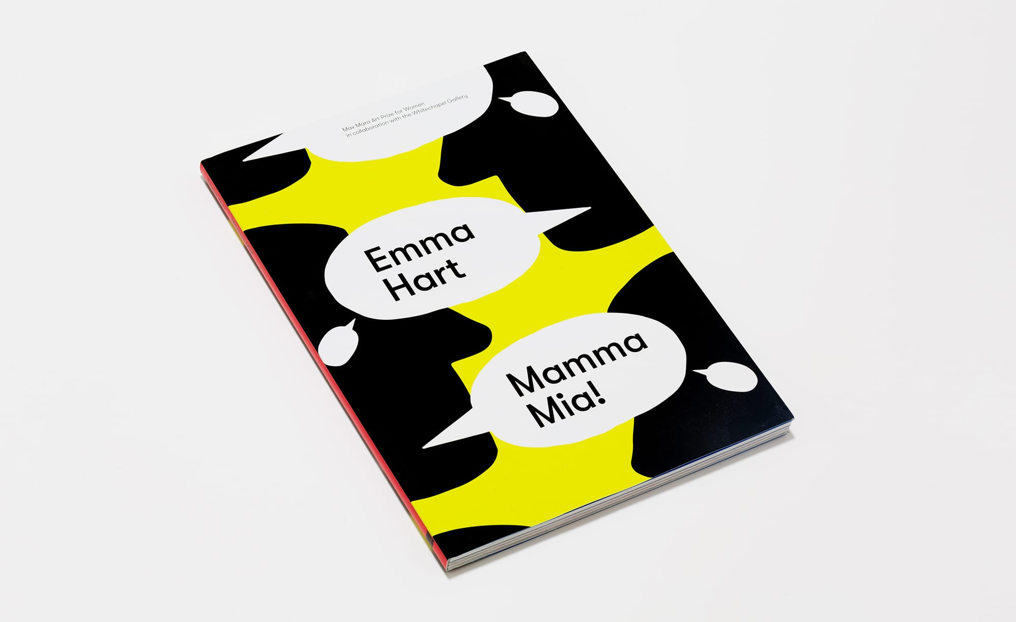
A sampling of Cameron's book designs
You helpfully specified the materials, the print processes and the binding. Is there a choice in there that a reader will feel in the hand without ever noticing it consciously?
I hope so. My goal, in finishing a project, is that it looks and feels, in some way, like it should exist as an object, in that specific form – whatever it ended up as. In this case, I really like the feel of the selected stocks in the hand, the flex of the book and that the binding allows you to open the pages as wide as possible. More obviously, I like the feel of the screen printed white against the embossed black stock. The materiality of the object is a really key aspect of any project.
I probably spend more time thinking about paper stocks, formats, binding and print processes than anyone approaching this for the first time might imagine.
You sent PDFs of inside pages and cover options for me to choose from. How did you feel about my choices?
I was very happy with your choices. The initial presentation is really part of a conversation towards consensus on the direction the design should develop. I learned a long time ago, to ensure that I was happy with, or could see potential in every design I present, but not be too precious about the details at that point – there are thousands of permutations that would produce successful designs at this stage, and it’s a case of refining them into a single coherent route that has its own structure and internal logic. This goes back to the venn diagram and the idea of a reciprocal exchange – the movement or incremental steps between your choices and my responses, your feedback and my decisions is the process.
You recommended the printer and dealt with them directly. For someone doing this for the first time, what does a designer do in that relationship that an author couldn't or shouldn't do alone?
As a designer, I bring prior knowledge of various printers and their specialisms and relative costs. I probably spend more time thinking about paper stocks, formats, binding and print processes than anyone approaching this for the first time might imagine. This knowledge can help avoid pitfalls but importantly can also propose opportunities/options that might not be known to the client. Like with many technical processes, there is a whole history and language around print so I can demystify some of the jargon. All of this offers a shorthand, which hopefully makes that whole process move more smoothly.
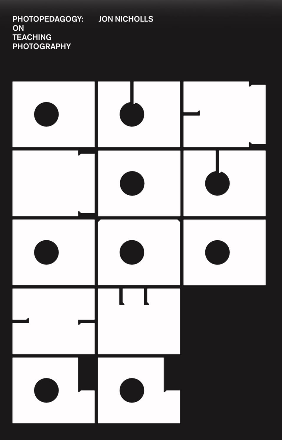
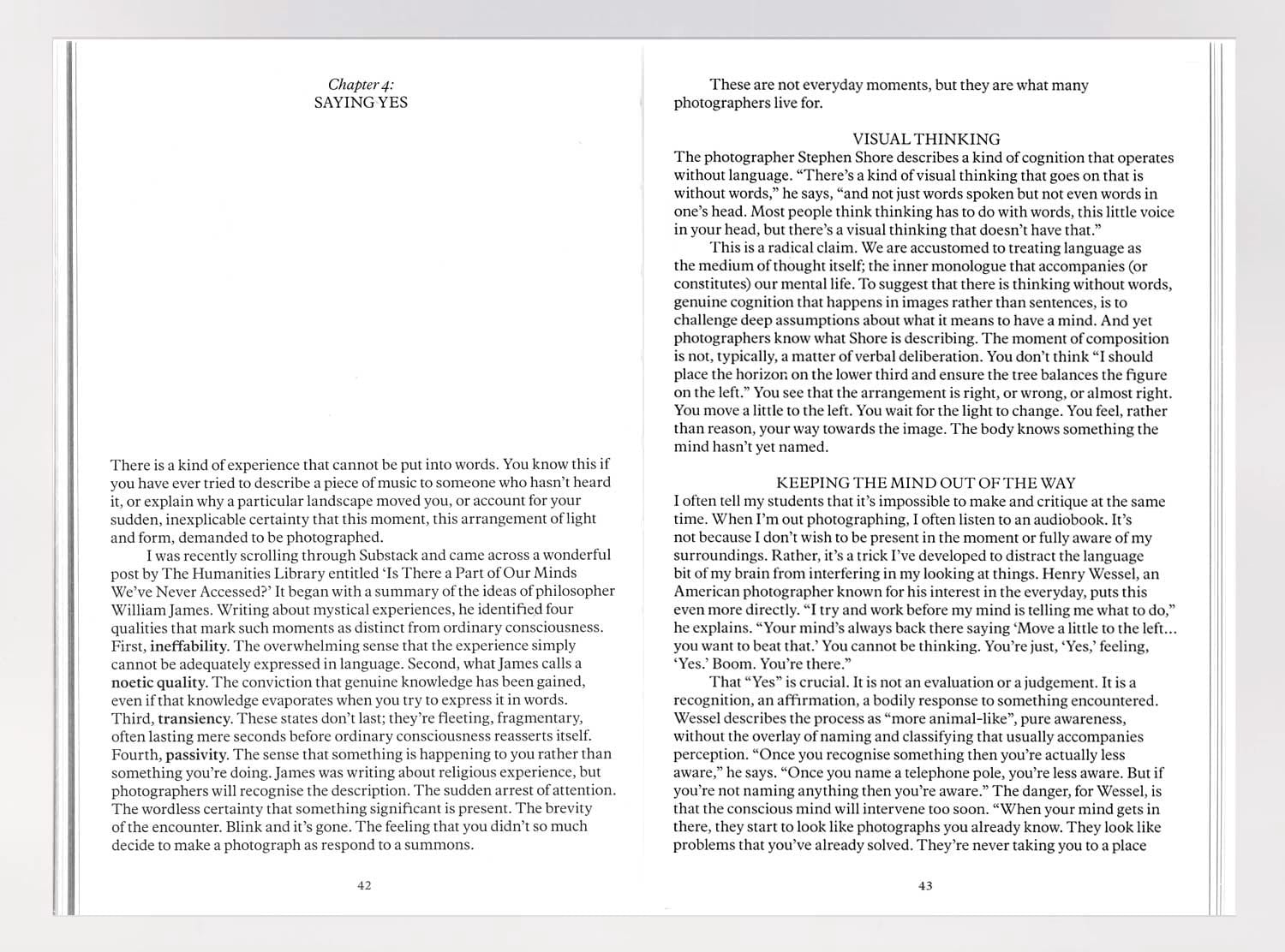
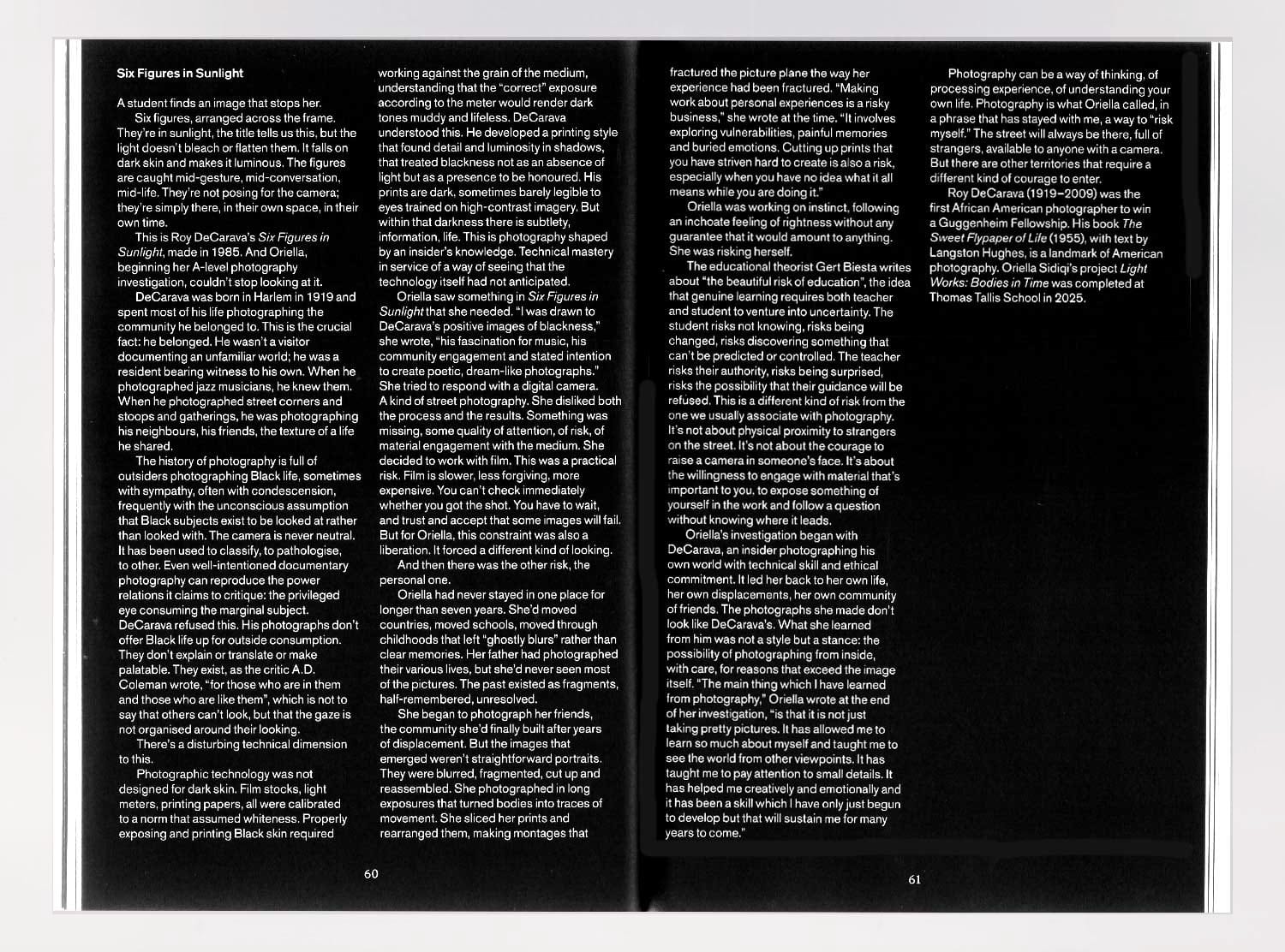
PhotoPedagogy: On Teaching Photography, cover and example spreads
If you had to name one thing that most first-time self-publishers get wrong about design, what is it?
Hmmm, that’s a tricky one. Maybe adding too much? Overtly visible design? Wanting a bit of everything? An example might be typographic styles becoming overly complicated (or being inconsistently applied) These aren’t necessarily ‘wrong’ in design, but they are difficult to get right and there does need to be a reason for them.
You’ve designed lots of books before. What was different/challenging about this one? How would you describe the role of the designer in the process, especially working with an inexperienced author?
I genuinely didn’t find it challenging! I thoroughly enjoyed working on it and hope that comes through in the finished book. I think the role of the designer is to create an appropriate visual language and physical object that silently reinforces and makes easily accessible the content of the text through listening, asking questions, providing options and working to make the production side of it as easy as possible! I think every job is different in its way, whether that’s because the client, the subject or the aims are new, but one thing I liked during this project – which may be due to inexperience – was how prepared you were and how thoroughly it had been thought through!
How do you feel about the finished book?
I’m really pleased with how it came out and it’s something I’m very happy to be associated with, thanks for asking me to do it!
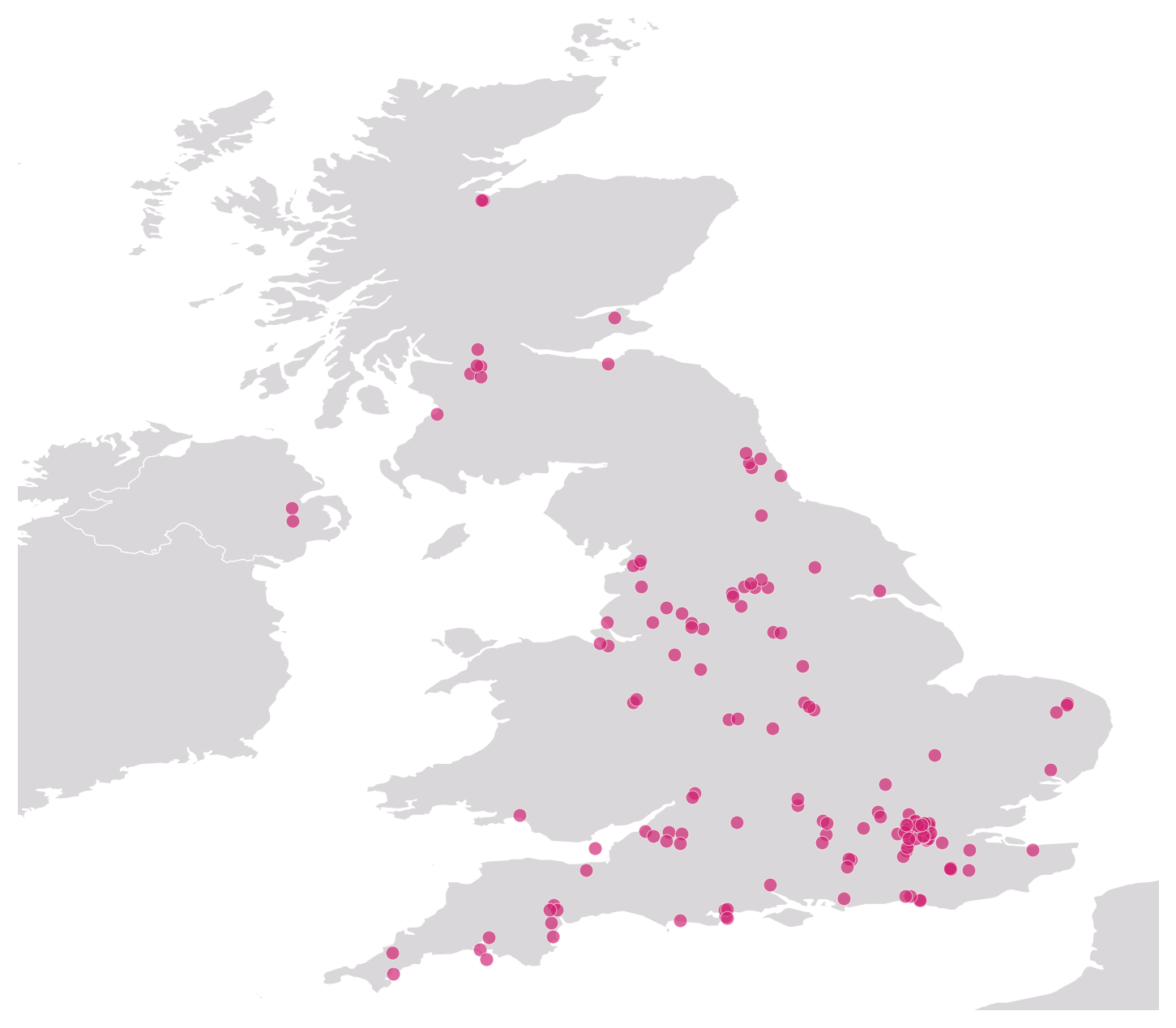
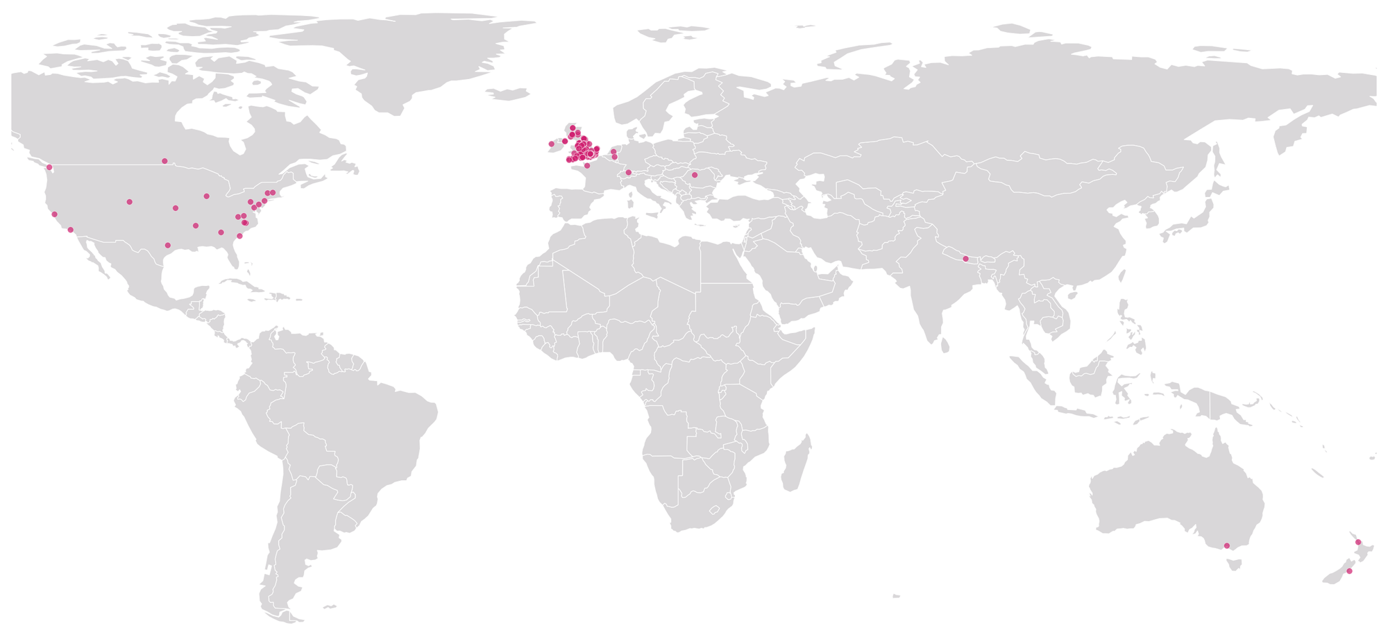
Thanks to Cameron for designing my book and for answering my questions. Below is a breakdown of the finances. The publishers sent me a few more copies of the book than I paid for (this often happens, apparently). I had not intended to make any kind of profit but, in fact, I've made a modest one. I'm planning to use the money to make a new book, this time designed for students of photography. More on that soon, I hope.
PhotoPedagogy: On Teaching Photography
Designed by Cameron Leadbetter | Printed by Gomer Press. B-format, 128pp. Edition of 200.
Expenditure
Printing: £2408; ISBN £77.50; Designer: £1500; Postage £960.61; Envelopes £77.96
Total: £5024.07
Income
Books gifted: 11; Orders placed: 239; Price: £20 + postage
Total: £5,558.00
Balance £533.93
Thanks for reading PhotoPedagogy! Subscribe for free to receive new posts.
These posts will always be free but, if you enjoy reading them, you can support my analogue photography habit, and that of my students, by contributing to the film fund. Thanks to those of you who have already done so. All donations of whatever size are very gratefully received.